Creative portfolio
Branding & Identity

The Photobooth Co.

Brand Guidelines & Visual Identity

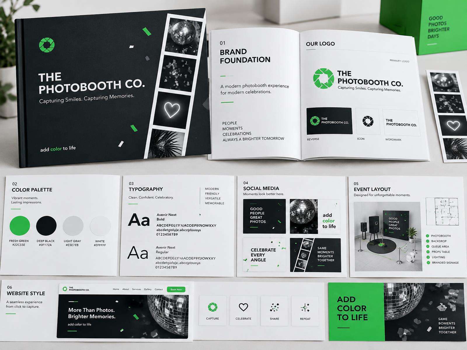
A complete brand guideline system designed to keep the brand consistent, recognizable, colorful, energetic and professional across digital, print and event materials.

  • Brand Guidelines
  • Visual Identity
  • Canva Design
  • Portfolio Case Study
  • Event Brand
The Photobooth Co. brand guideline preview showing logo, palette, typography and brand applications

Complete visual identity system

add color to life

Client
The Photobooth Co.
Industry
Photobooth & Event Entertainment
Project
Brand Guidelines / Visual Identity
Tools
Canva · ChatGPT
01Project Overview

One system. Every touchpoint.

Capturing Smiles.
Capturing Memories.

add color to life

This project defines the official visual and communication system of The Photobooth Co. The guideline helps keep all designs, marketing materials, social media content, event layouts, website visuals, reports and client-facing materials consistent, professional and aligned with the brand identity.

The goal is to make The Photobooth Co. recognizable, memorable and trusted across all platforms while maintaining a fun, energetic and event-focused personality.

The Photobooth Co. is a professional photobooth and event entertainment service established in 2017. It creates memorable experiences for weddings, corporate events, birthdays, debuts, school events, brand activations, government events and private celebrations through professional equipment, instant prints, customized layouts and reliable on-site support.

dphotoboothco@gmail.com www.thephotoboothco.com
The Challenge

Bring every brand piece into focus.

The business needed one professional system to organize its identity, messaging, colors, typography, logo usage, photography direction, graphic elements, data visuals and applications—without losing its fun, energetic personality.

The Solution

A complete, usable identity system.

A complete guideline was developed for brand purpose, visual direction, logo use, color, typography, communication, photography, graphic elements, icons, visual data and real-world applications across digital, print and events.

02Brand Purpose

Make every event more memorable.

The brand turns moments into fun, interactive and lasting keepsakes—creating an atmosphere of connection and excitement that guests can enjoy and remember.

Creativity

Professionalism

Reliability

Fun

Memorable Experiences

Customer Satisfaction

Brand Goal

To become a trusted and recognizable photobooth brand that helps make every event more memorable, engaging and picture-perfect.

09Real Event Videos

Real Event Highlights

Watch real moments, guest experiences, and photobooth highlights from The Photobooth Co. events.

Real event

Event Highlights

Photobooth Event Highlight

Real event moments featuring The Photobooth Co. experience, guest smiles, and fun photobooth memories.

Play with sound
Real event

Event Highlights

Event Moments Highlight

A quick look at real event guests enjoying the photobooth experience.

Play with sound
Real event

Event Highlights

Guest Moments Highlight

Capturing smiles, memories, and fun interactions during live events.

Play with sound
Real event

Event Highlights

Photobooth Experience Highlight

A real event preview showing how The Photobooth Co. adds fun and excitement to celebrations.

Play with sound
Real event

Event Highlights

Celebration Highlight

Real photobooth moments from events, celebrations, and special occasions.

Play with sound
Real event

Wedding Events

Wedding Photobooth Highlight

A glimpse of how The Photobooth Co. adds fun, smiles, and memorable keepsakes to wedding celebrations.

Play with sound
Real event

Mirror Booth

Mirror Booth Event Highlight

A real mirror booth event highlight showing an interactive and stylish photobooth experience.

Play with sound
Real event

Dedication Photobooth

Dedication Photobooth Highlight

A real dedication photobooth experience designed to make event messages and memories more meaningful.

Play with sound
03Vision & Mission

Built for memorable experiences.

Vision

A recognized event brand.

To become one of the most trusted and recognized photobooth and event entertainment providers in the Philippines, known for creativity, professionalism, innovation and excellent customer service.

Mission

Exceptional service, every event.

To deliver exceptional photobooth experiences through professional service, creative solutions and reliable event support.

04Brand System Highlights

A complete identity toolkit.

Each guideline chapter gives the brand a clear rule, purpose and application—making the system practical for future content and client work.

NO.03

Logo System

Defines primary, secondary and icon logos, plus spacing and minimum-size rules.

NO.04

Color Scheme

Defines the green, black, white and supporting green palette used across the brand.

NO.05

Typeface

Defines Poppins for headings, body text, buttons, captions and brand messages.

NO.06

Brand Voice & Tone

Keeps communication fun, friendly, energetic, professional and event-focused.

NO.07

Photography

Guides bright, professional imagery of real smiles, setups, prints and event moments.

NO.08

Graphic Elements

Uses rounded shapes, photo frames, strips, sparkles, cameras and green accents.

NO.09

Brand Icons

Defines simple rounded icons for services, contacts, categories, features and steps.

NO.10

Visual Data

Sets a clear branded style for charts, reports and easy-to-understand summaries.

NO.11

Brand Application

Applies the system to websites, social media, print, events, reports and documents.

Color Scheme

Bright Green

Primary energy

Black

Strength & contrast

White

Space & clarity

Light Gray

Balance & support

Typeface System

Poppins

A clear, modern family for headings, body copy, buttons, captions and confident brand messages.

RegularSemiboldExtra Bold
05Design Direction

Fresh, lively and built for celebration.

The overall direction combines clean structure, modern presentation and energetic event personality.

Green brings vibrancy and excitement, black gives strength and contrast, white keeps the brand clean and modern, and light gray supports balance and clarity.

01

Polishednot too formal

02

Energeticnot chaotic

03

Funstill professional

04

Youthfulstill trustworthy

05

Engagingalways clear

06Brand Voice

Warm enough to celebrate. Clear enough to trust.

The voice is fun, friendly, energetic, professional and event-focused. Every message should help clients feel confident that their occasion will be memorable, engaging and picture-perfect.

Friendly

Warm, welcoming language that feels personal and easy to connect with.

Energetic

Lively, positive messages that reflect the excitement of every celebration.

Professional

Clear, confident communication that reinforces quality, service and reliability.

07Visual Data

Information, made instantly clear.

Reports, inquiry sources, booking trends, campaign results, engagement, reach and performance summaries use readable labels, clear spacing and minimal clutter.

Style previews · illustrative data only

Lead Source Overview

Event Type Inquiries

Events

Monthly Inquiries Trend

08Brand Application

One identity, ready for the real world.

Every material stays consistent, recognizable and professional while preserving the brand's fun, energetic and event-focused personality.

01

Digital Applications

Web pages, booking touchpoints and digital campaigns.

02

Print Applications

Flyers, cards, booth materials and printed keepsakes.

03

Social Media Applications

Consistent posts, stories, campaigns and announcements.

04

Event Layouts

Branded frames, strips and on-site visual experiences.

05

Client-Facing Documents

Proposals, quotations and polished communication materials.

06

Reports and Presentations

Branded summaries that make information easy to follow.

10Process

From discovery to a usable brand guide.

  1. 01

    Brand Assessment

    Understanding the business, services, audience and positioning.

  2. 02

    Identity Direction

    Defining the emotional and visual direction of the brand.

  3. 03

    Visual System Development

    Building logo usage, color, typography and style guidance.

  4. 04

    Content & Application Planning

    Planning social, website, promotional and event applications.

  5. 05

    Brand Consistency Planning

    Creating a structure that keeps future designs aligned.

  6. 06

    Final Brand Guideline Presentation

    Organizing the identity into a presentable and usable guide.

11Deliverables

A complete guideline package.

A structured identity reference designed to guide future marketing, event and client materials.

  • Brand guideline structure
  • Brand purpose definition
  • Brand values and goals
  • Vision and mission
  • Logo system
  • Secondary logo usage
  • Logo clear space
  • Logo minimum size
  • Color scheme
  • Typography system
  • Typesetting and hierarchy
  • Brand voice and tone
  • Tone variations
  • Photography direction
  • Graphic elements
  • Brand icons
  • Visual data style
  • Brand application guide
  • Digital application guide
  • Print application guide
  • Final brand presentation
12Final Result

Consistent from first glance to final print.

The final output is a complete brand guideline system that gives The Photobooth Co. a clear, consistent and professional visual identity. Every touchpoint—from social media posts and website visuals to event layouts, printed materials, reports and client documents—now follows one recognizable direction.

  • Consistent
  • Memorable
  • Professional
  • Scalable
  • Engaging
  • Visually cohesive
  • Ready for real-world use

Need a Brand Guideline for Your Business?

I help businesses create clean, consistent and professional brand identity systems that can be used across social media, websites, print materials and client-facing content.

Work With Me